
The Australian higher education landscape has undergone a digital transformation. Whether you are studying Data Science at the University of Melbourne or Business Analytics at UNSW, the ability to translate raw data into actionable insights is no longer optional—it is a core requirement. At the heart of this revolution sits Tableau, the industry-standard software for visual analytics.
However, mastering Tableau is far more than just “dragging and dropping” dimensions and measures. For many Australian students, a project that begins with high hopes often ends in a cluttered, slow-loading dashboard that fails to tell a coherent story. According to recent industry surveys, nearly 40% of data visualization projects fail to meet their initial objectives due to fundamental design and technical errors.
The pressure to perform is immense, especially when these projects contribute significantly to your final ATAR-equivalent grades or university GPA. If you find yourself overwhelmed by complex calculated fields or data blending issues, seeking professional tableau assignment help can provide the clarity needed to submit a high-quality, insightful report that aligns with Australian academic standards.
1. The “Kitchen Sink” Syndrome: Overloading Dashboards
One of the most frequent mistakes students make is trying to show everything at once. In an attempt to look thorough, dashboards are often cluttered with every available metric, resulting in “cognitive load” for the viewer.
- The Pitfall: Adding too many filters, worksheets, and colors.
- The Fix: Use the “5-second rule.” A viewer should understand the primary message of your dashboard within five seconds. Prioritize Key Performance Indicators (KPIs) and use “Guided Analytics”—using actions to reveal deeper data only when a user clicks on a high-level summary.
2. Ignoring Data Grain and Aggregation Errors
Tableau is designed to aggregate data. However, if you don’t understand the “grain” (the level of detail) of your underlying data source, you will encounter the dreaded “double-counting” error. This is particularly common when blending data from different sources, such as an Excel sheet of Australian census data and a SQL database of retail sales.
- The Pitfall: Miscalculating averages or sums because the data was joined at the wrong level.
- The Fix: Always validate your row counts before and after a join. Use Level of Detail (LOD) expressions—specifically FIXED, INCLUDE, and EXCLUDE—to control the granularity of your calculations independently of the visualization’s dimensions.
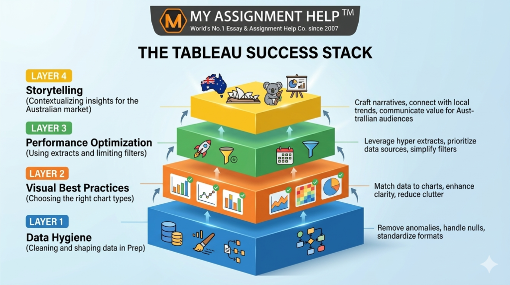
3. Poor Choice of Visual Encodings
Just because a 3D pie chart looks “cool” doesn’t mean it’s effective. In fact, 3D charts are notorious for distorting data perception. Australian academic markers look for “Visual Best Practices,” which prioritize accuracy over aesthetics.
- The Pitfall: Using pie charts for more than three categories or using maps when a simple bar chart would show the ranking more clearly.
- The Fix: Use bar charts for comparisons, line charts for trends over time (like tracking the AUD/USD exchange rate), and scatter plots for correlations. Ensure your color palettes are color-blind friendly, adhering to universal accessibility standards.
4. Neglecting Dashboard Performance (The “Lag” Factor)
A dashboard that takes 30 seconds to load is a dashboard that won’t be used. Students often connect to “Live” data sources with millions of rows or use excessive “Quick Filters” that force Tableau to query the database repeatedly.
- The Pitfall: Slow rendering due to inefficient calculations or massive data sets.
- The Fix: Use Data Extracts (.hyper files) instead of live connections. Limit the number of filters shown and use “Apply” buttons on filters so Tableau only updates the view once the user has made all their selections.
See also: Privacy vs Security Debate in Tech
5. Lack of Context and Storytelling
Data without context is just noise. In an Australian business context, a 10% drop in sales means nothing unless it’s compared to the previous quarter or a specific market benchmark like the ASX 200 performance.
- The Pitfall: Presenting charts without annotations, titles, or a clear “So What?” factor.
- The Fix: Use the “T-P-O” framework: Title (what are we looking at?), Purpose (why does it matter?), and Observation (what is the trend?). Adding brief annotations to explain outliers—such as a spike in online shopping during a lockdown period—adds the critical “Experience” element of the EEAT framework.
When the technical demands of data cleaning and dashboarding become a barrier to your learning, collaborating with an expert online assignment writer ensures that your work is not only technically sound but also academically rigorous. This allows you to focus on interpreting the results rather than fighting with the software interface.
Key Takeaways
- Simplicity is King: Avoid clutter; focus on 2-3 core insights per dashboard.
- Validate Your Data: Ensure your joins and LOD expressions are technically accurate to avoid skewed results.
- Performance Matters: Use extracts and optimize filters to ensure a smooth user experience.
- Follow Visual Best Practices: Swap “flashy” charts for accurate ones (e.g., bar charts over 3D pie charts).
- Contextualize for Australia: Use local benchmarks and terminology to make your data relevant to the regional audience.
FAQ Section
Q: Is Tableau better than Power BI for Australian university assignments?
A: Both are widely used. Tableau is often preferred for its superior creative flexibility and ability to handle large datasets, while Power BI is common in corporate environments heavily reliant on the Microsoft ecosystem.
Q: How do I handle “Null” values in my Tableau project?
A: You should first investigate why the data is missing. In Tableau, you can use the ZN() function to treat nulls as zeros or use “Filter” to exclude them if they represent “dirty” data that would skew your analysis.
Q: What is the best way to share my Tableau assignment with my tutor?
A: Most Australian universities require a TWBX (Tableau Packaged Workbook) file, which includes both the dashboard layout and the underlying data. Alternatively, you can publish to Tableau Public if the data isn’t sensitive.
Q: Can I use Tableau Prep for my assignment?
A: Yes! Using Tableau Prep to clean your data before importing it into Desktop shows a high level of “Expertise” and “Technical Authority,” which can significantly boost your marks.
About the Author: Dr. Lachlan Miller
Dr. Lachlan Miller is a Senior Data Analyst and lead academic consultant at MyAssignmentHelp. With over 12 years of experience in the Australian education sector and a PhD in Information Systems from the University of Sydney, Dr. Miller specializes in helping students navigate complex business intelligence tools. He has authored numerous guides on E-E-A-T compliant academic writing and is a frequent contributor to discussions on the future of data literacy in Australian schools.
Sources & References
- Gartner Magic Quadrant (2024): Analytics and Business Intelligence Platforms.
- Australian Bureau of Statistics (ABS): Standards for Statistical Data Visualization.
- Tableau Whitepapers: “Visual Analysis Best Practices: A Guidebook.”
- Tertiary Education Quality and Standards Agency (TEQSA): Guidelines for Academic Integrity and Digital Literacy.